
The Problem
Seattle Granola Company was using an outdated website that tested poorly with users, had a very low conversion rate, was unresponsive, visually unappealing, difficult to navigate and ranked low in search engines.
The Solution
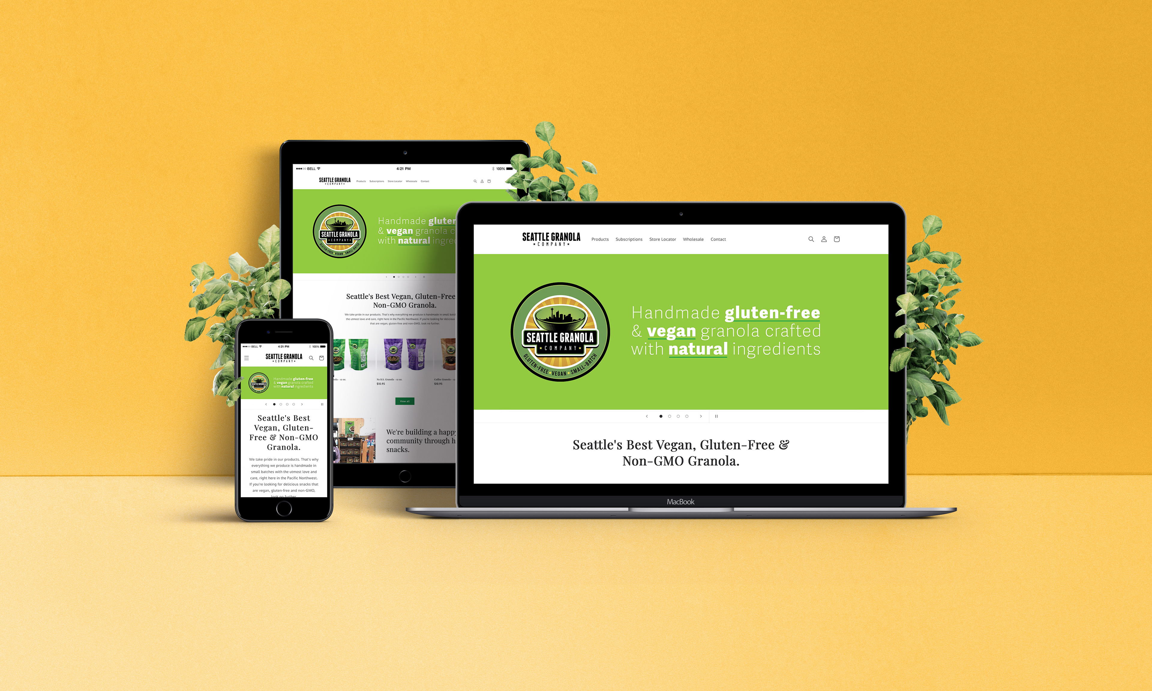
I performed a wide variety of research methods, including user interviews, surveys and A/B testing. From the data obtained in my research, I sketched, wireframed, prototyped and implemented a new website that better meets the needs of our customers. It offers a seamless shopping experience, featuring a clear, responsive layout and modern visual design.
The Outcome
Seattle Granola Company now has a website that meets the needs of their customers, is easier to use, consistent with their brand, ranks higher in search engines and has a higher conversion rate than its competitors.
My Role
User Researcher, UX/UI Designer, Web Designer
Materials Used
• Pencil and paper (page sketches)
• Adobe Illustrator (sitemap, wireframes, user flows)
• Adobe Xd (interactive prototype)
• Adobe Photoshop (photography)
• Shopify (website build)
• HTML and CSS (customization)
Research Methods Used
• User interviews
• Surveys
• User demographics
• A/B testing
• Competitive analysis
• Usability testing
Seattle Granola Company was using an outdated website that tested poorly with users, had a very low conversion rate, was unresponsive, visually unappealing, difficult to navigate and ranked low in search engines.
The Solution
I performed a wide variety of research methods, including user interviews, surveys and A/B testing. From the data obtained in my research, I sketched, wireframed, prototyped and implemented a new website that better meets the needs of our customers. It offers a seamless shopping experience, featuring a clear, responsive layout and modern visual design.
The Outcome
Seattle Granola Company now has a website that meets the needs of their customers, is easier to use, consistent with their brand, ranks higher in search engines and has a higher conversion rate than its competitors.
My Role
User Researcher, UX/UI Designer, Web Designer
Materials Used
• Pencil and paper (page sketches)
• Adobe Illustrator (sitemap, wireframes, user flows)
• Adobe Xd (interactive prototype)
• Adobe Photoshop (photography)
• Shopify (website build)
• HTML and CSS (customization)
Research Methods Used
• User interviews
• Surveys
• User demographics
• A/B testing
• Competitive analysis
• Usability testing
Timeline
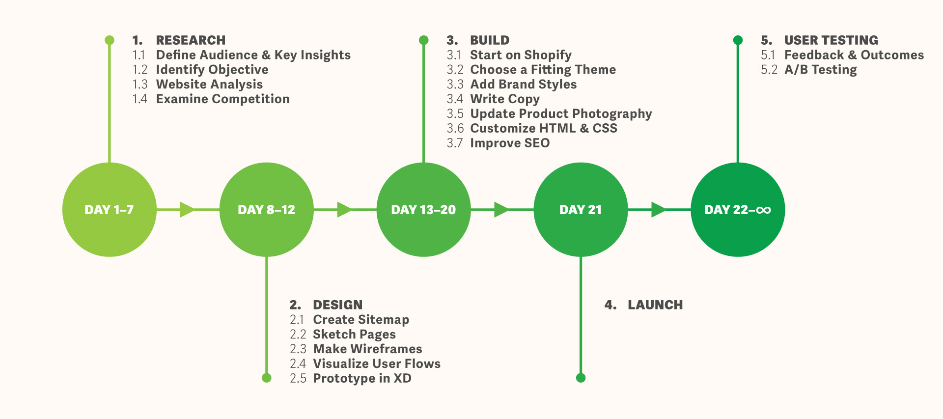
1. Research
As with every design project, I started this one with research. The goal of my research was to define the wants and needs of Seattle Granola Company's users, identify the objective of the company's e-commerce platform and analyze their current website to best inform my decisions when designing their new one.
1.1 Define Audience, Create User Persona, Identify Key Insights
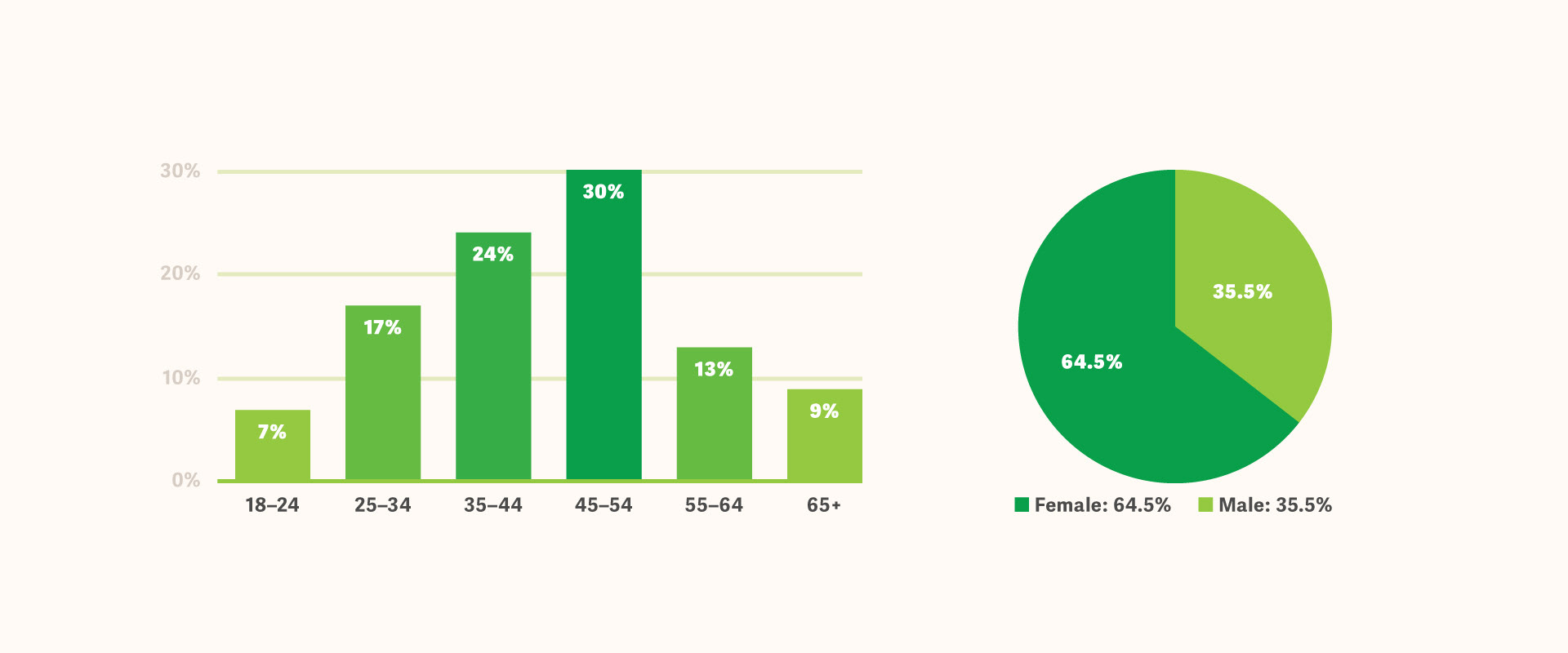
Using analytics from Volusion, Google, Facebook and Instagram, I found Seattle Granola Company's audience to be primarily composed of health-conscious females aged 35–54 who enjoy the outdoors. Not surprisingly, most of their customers live in the Pacific Northwest.
I spent the next week gathering data from one-on-one interviews, surveys and social media interactions with our users.

I generated a user persona based on the data I obtained from my research. This persona would be key in informing the decisions I made when redesigning the experience of the website.
These are the primary insights I gathered from my research:
1. Interface
These are the primary insights I gathered from my research:
1. Interface
The website should have an easy-to-navigate interface that allows the user to find the information they need without having to navigate through multiple pages.
2. Support
2. Support
The website should provide easy access to customer support, such as a chat function and a contact form, so that the user can get answers to any questions they may have.
3. Visuals
3. Visuals
To reflect the company's focus on health and wellness, the website could use natural colors such as green, blue, and brown. The brand's primary color is a nice forest green, so sticking to the visual style guide will be effective.
4. Fonts
4. Fonts
The website should use a clean, modern sans-serif typeface for body copy and a bold, playful display font for headings.
5. Editorial Style
5. Editorial Style
The tone of voice used on the website should be friendly and informative, reflecting the company's small, local business values and approachability.
6. Layout
6. Layout
The website layout should be clean and modern, with clear sections for product information, customer support and checkout process to help the user accomplish their goals quickly and easily.
1.2 Identify Objective
As with most online stores, the objective of their e-commerce platform is first and foremost to sell their products, reaching new customers and retaining existing ones. They also aim to inform potential customers of the health benefits of the ingredients they use, as well as provide information on the company itself.
1.3 Website Analysis
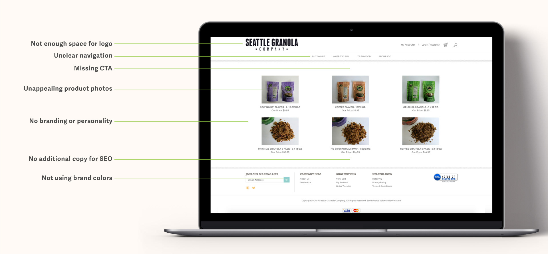
I found many issues with the existing Seattle Granola Company website in my analysis. There was a lack of hierarchy, inconsistent brand styles and no clear call to action. The tone of the website was plain and without character; it was simply a place to buy granola and nothing else.
Fixing the design issues would be one thing, but I really needed to focus on highlighting the brand's personality to truly allow customers to better connect with the brand.
Fixing the design issues would be one thing, but I really needed to focus on highlighting the brand's personality to truly allow customers to better connect with the brand.
1.4 Examine Competition
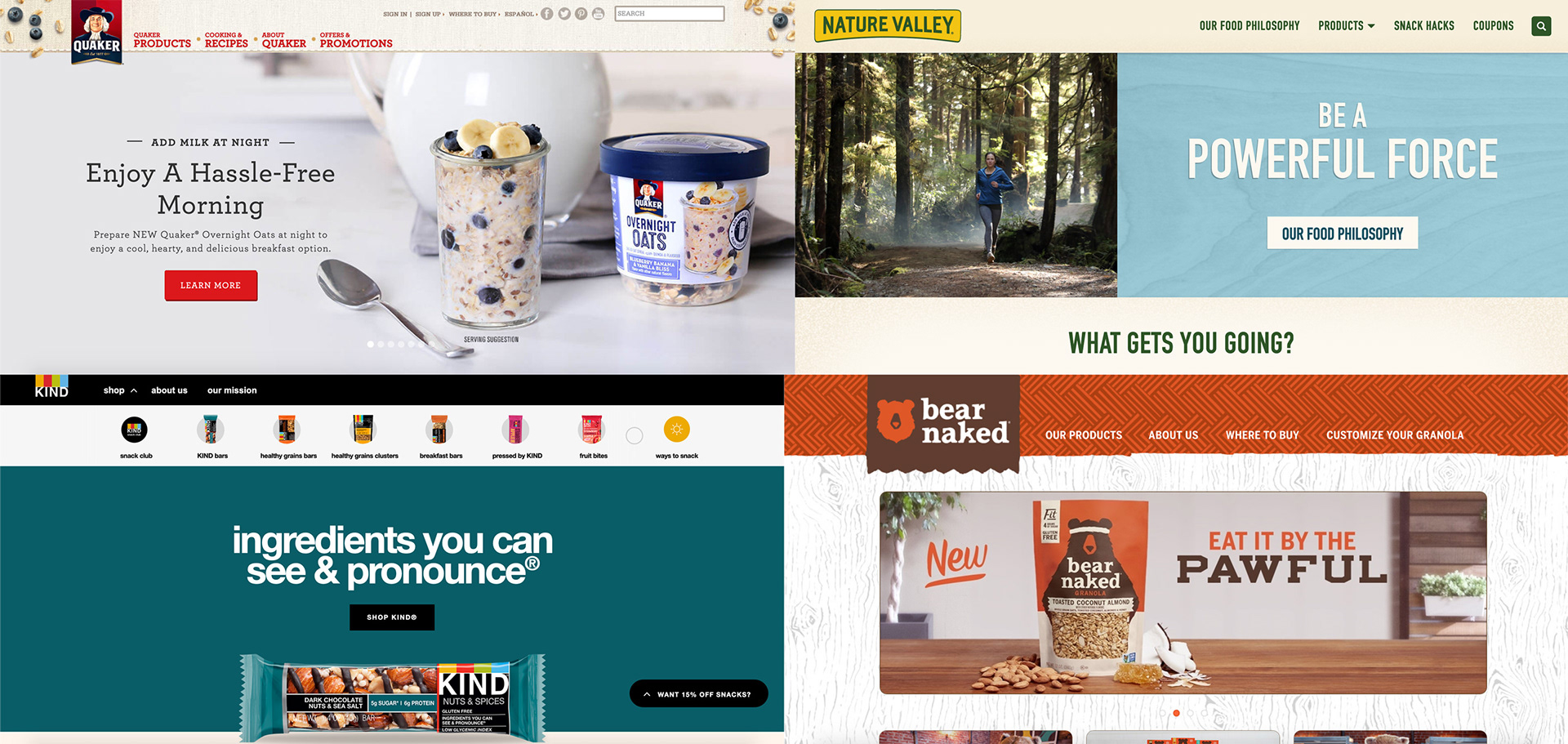
I looked at the websites of the world's most popular granola brands and they all had elements in common that the Seattle Granola Company website lacked:
• They displayed a clear call to action at the top of the page
• They used only high-quality photos of their products
• They prominently displayed their brand story on the homepage
• They adhered to the visual standards established by their brand
• Most importantly, their websites were easy to navigate
These insights provided me with a clear starting point for the visual aspect of my redesign process.
2. Design
It was now time for my favorite step in every project: the design. I would use the insights from my research to help direct my decision making during this phase.
This stage of the process involved creating a sitemap for the existing website, sketching an updated layout, creating wireframes and building a working prototype with the aid of user flows.
This stage of the process involved creating a sitemap for the existing website, sketching an updated layout, creating wireframes and building a working prototype with the aid of user flows.
2.1 Sitemap
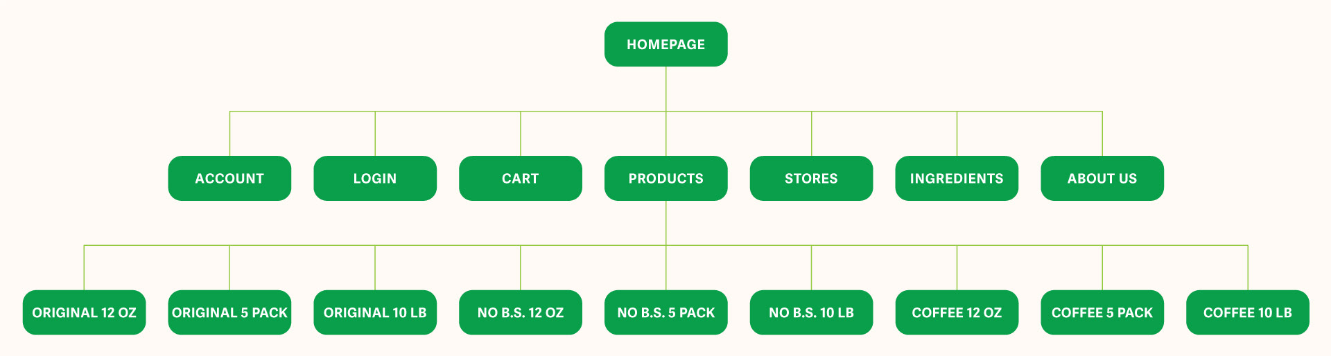
To start with, Seattle Granola Company had a simple and straightforward sitemap. Because of this, I didn't feel it necessary to alter the structure of their website. I would keep the existing pages and focus on how users could better navigate them with clear wording and improved hierarchy.
2.2 Sketch Pages
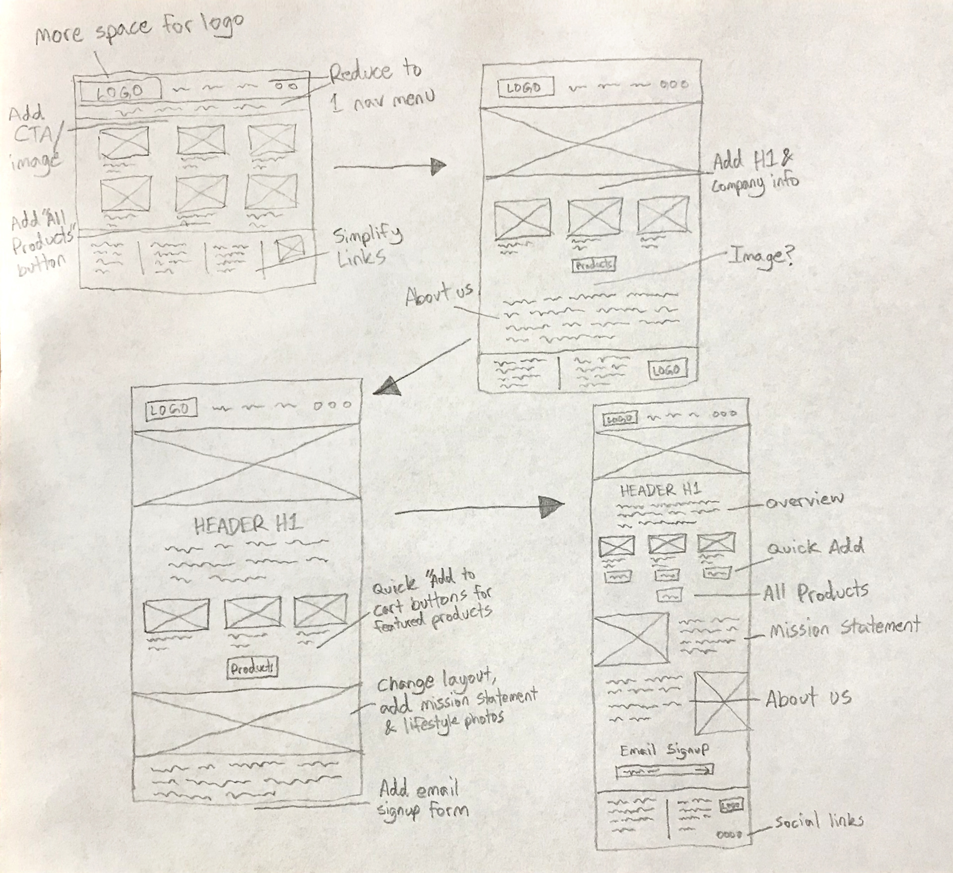
Using the insights gained from my research and my understanding of the Seattle Granola Company brand, I began sketching potential layouts for every page that would meet the needs of our users, as well as the company itself.
My goal was to make each page consistent and easy to navigate, while still including all of the necessary information and adhering to the company's brand guidelines.
My goal was to make each page consistent and easy to navigate, while still including all of the necessary information and adhering to the company's brand guidelines.
2.3 Wireframes
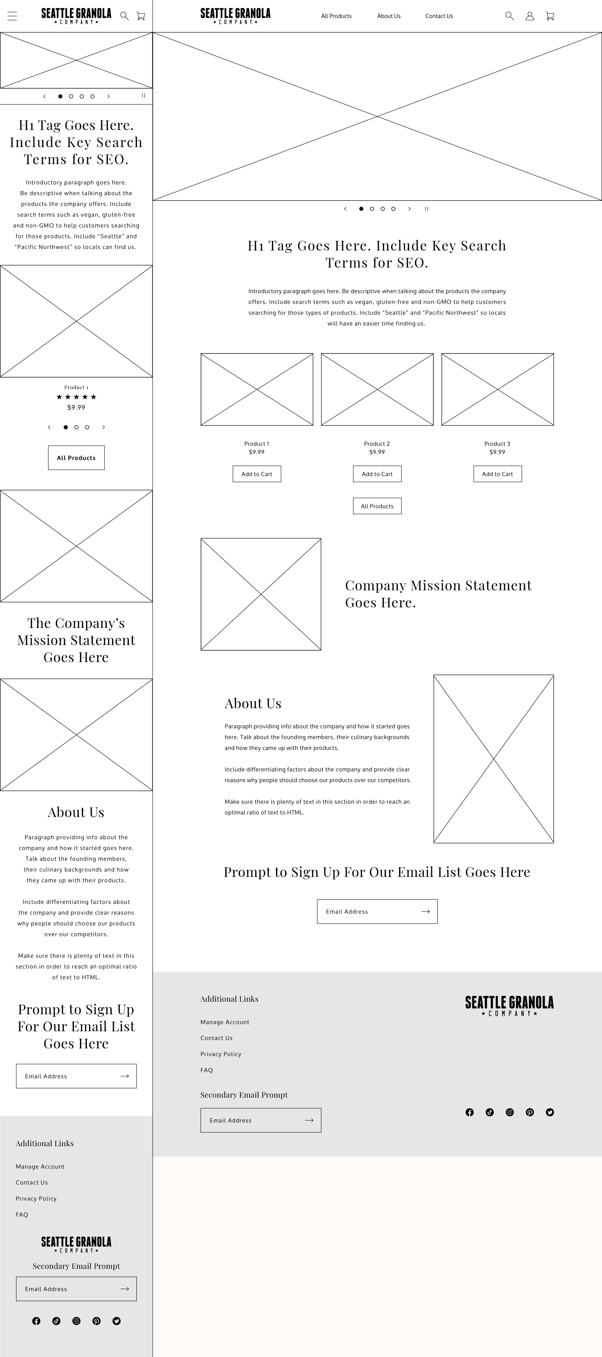
Next, I created low-fidelity wireframes based on my sketches for every page using Adobe Illustrator. We didn't yet have the final copy for every page, so I replied on placeholder text to get the layout right.
2.4 User Flows
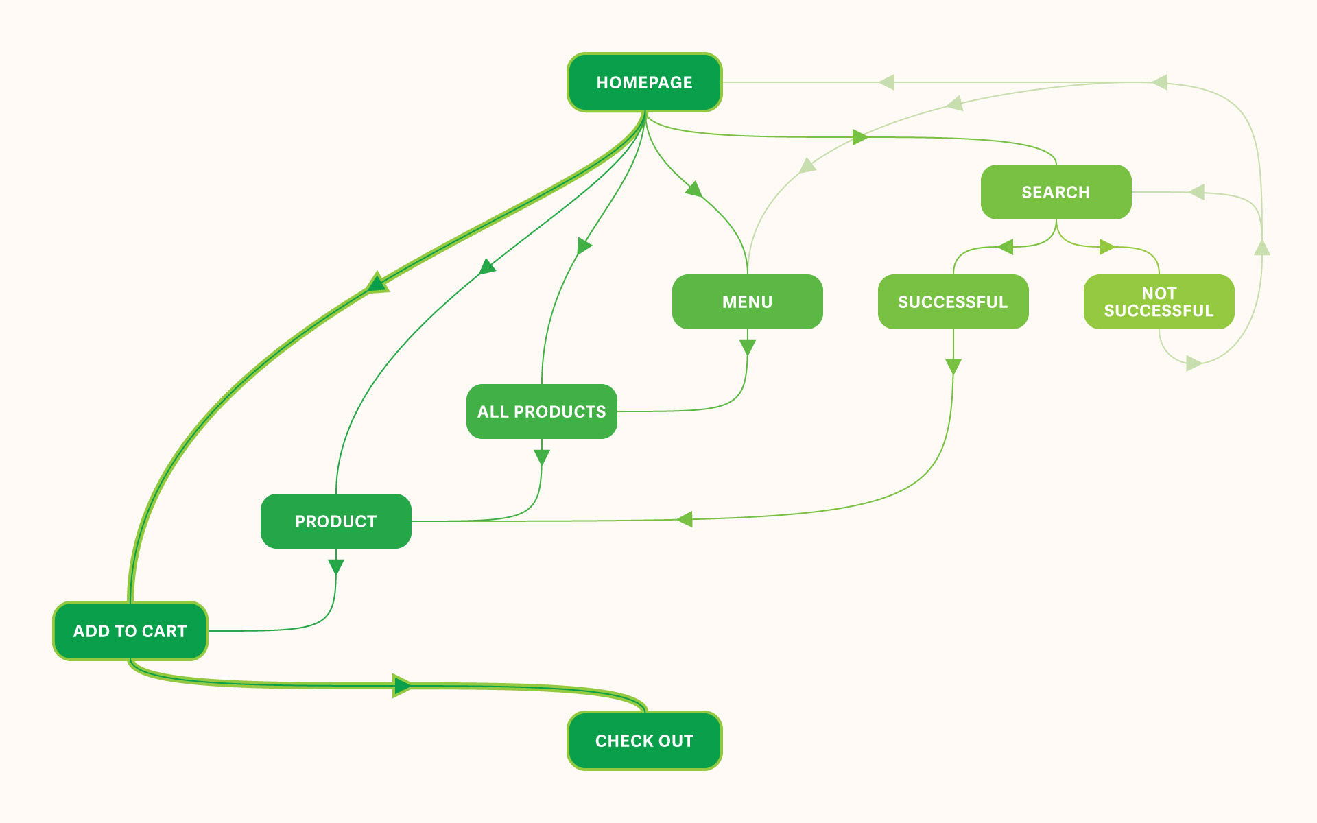
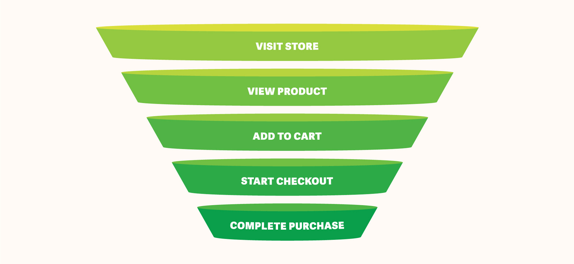
Navigating the old website and trying to perform the simple task of adding a product to your shopping cart could be a chore. I wanted to make it as easy as possible for our users to find the information they need and purchase the products they want.
As shown in the user flow above, I created several ways to add a product to your cart from nearly every page on the website. The most efficient way is to add featured products directly from the homepage, but users can also browse through all products or search for something specific.
As shown in the user flow above, I created several ways to add a product to your cart from nearly every page on the website. The most efficient way is to add featured products directly from the homepage, but users can also browse through all products or search for something specific.
2.5 Prototype
The purpose of this prototype is to test the usability of the many different ways a user might attempt to add a product to their shopping cart. The quickest way is to simply scroll down to the first featured product and click "Add to Cart", but you can also view the individual product page and browse through all products. Once the "Check Out" button has been pressed, the task is considered complete.
3. Build
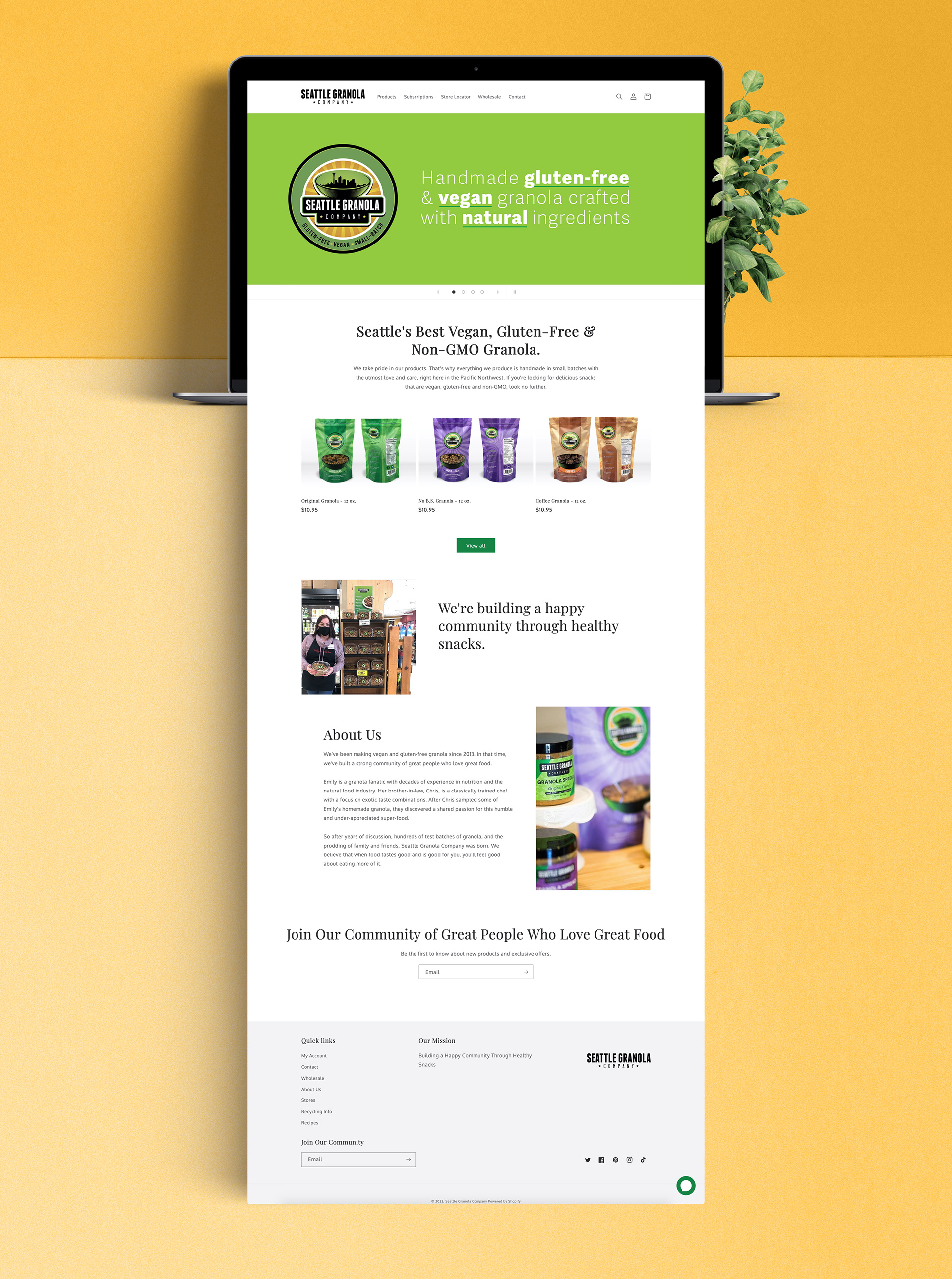
This section outlines how I built the new Seattle Granola Company website on Shopify. You'll see how I chose the theme, added brand styles, updated the product photography, customized the code, and improved the website's SEO.
3.1 Migrate to Shopify
After discussing which ecommerce platform would be the best fit for Seattle Granola Company's online store, we decided on Shopify. I handled the migration from their previous platform, securely transferring the existing product, customer, order and domain information.
3.2 Choose a Fitting Theme
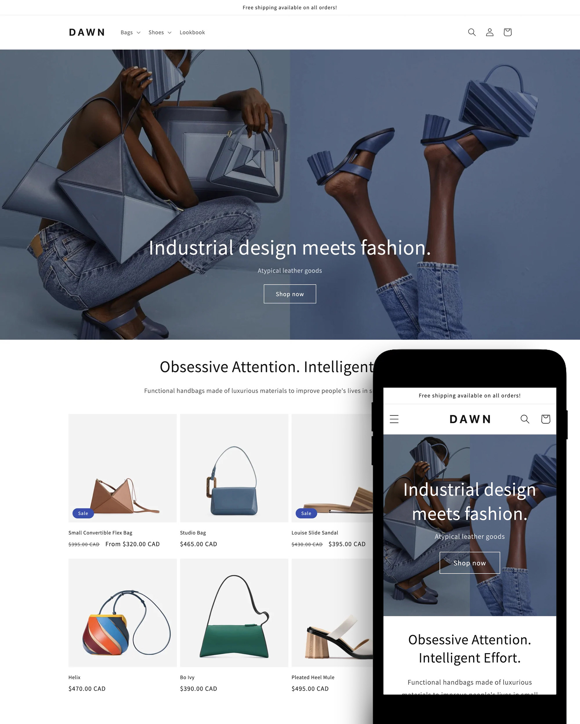
Once the back end of the website was in place, I chose a theme to serve as a template for my new design. I picked the theme that most closely aligned with my sketches and wireframes to reduce the amount of custom code necessary. As a bonus, the theme was free, which saved the company some money.
3.3 Add Brand Styles
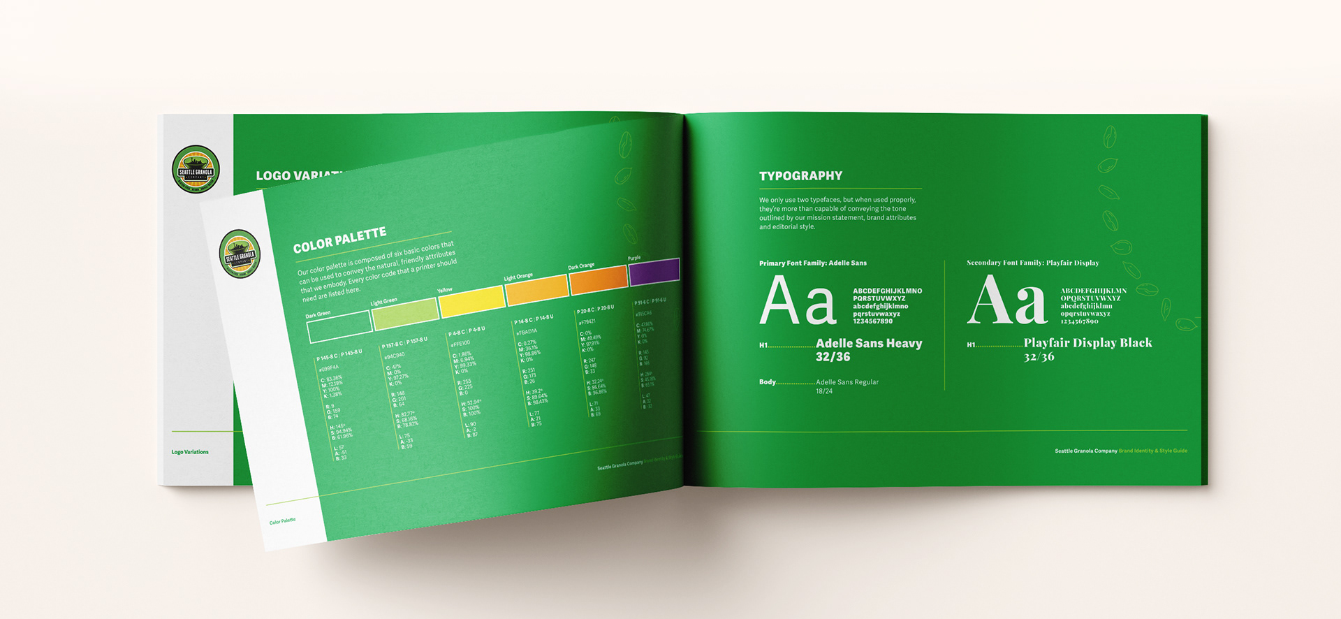
With the theme in place, I began adding the brand styles that aligned with Seattle Granola Company's Brand Identity & Style Guide. These styles included typefaces, brand colors and logo standards.
The important thing was for the website to look and feel consistent with the existing product packaging, social media and marketing collateral.
The important thing was for the website to look and feel consistent with the existing product packaging, social media and marketing collateral.
3.4 Write Copy
The existing copy on the old website felt outdated, had several spelling and grammar issues and lacked many important search terms which would aid in search engine optimization.
I wrote the majority of the copy for the new website, including CTAs, product descriptions and info pages.
I wrote the majority of the copy for the new website, including CTAs, product descriptions and info pages.
3.5 Update Product Photography

Even if I fixed everything else on the website, the old low-quality photographs would certainly detract from the customer experience and result in a lower conversion rate. I took time to refresh their product photography to make sure their granola looks as good as it tastes.
3.6 Customize HTML & CSS

Here is an actual photo of me actually customizing the actual theme code. Behold as I edit the HTML and CSS to change the appearance of text, photos, buttons and other graphic elements to more closely match the brand identity.
The front-end customization features on Shopify are quite comprehensive, so the custom code I wrote for the website was kept to a minimum.
The front-end customization features on Shopify are quite comprehensive, so the custom code I wrote for the website was kept to a minimum.
3.7 Search Engine Optimization
Once I achieved the intended look of the website, it was time to improve the search engine optimization. I followed best practices and took several steps to ensure Seattle Granola Company would rank #1 when searching for vegan and gluten-free granola in the Seattle area, an area unsurprisingly dense with granola and muesli brands.
Here are the steps I took to increase searchability and reduce page load times:
1. Eliminate unnecessary code
Here are the steps I took to increase searchability and reduce page load times:
1. Eliminate unnecessary code
2. Write concise and accessible alt tags for every image
3. Optimize image sizes
4. Add key search terms to paragraphs across all pages
5. Include relevant internal links
4. Launch
With the website fully redesigned and built, it was time to launch. On Shopify, this simply involves clicking a button. Is this section unnecessary? Maybe. Did I still feel the need to declare the fact that I did indeed launch the website? You bet.
5. User Testing
Hooray! The website is complete! Not so fast. It was now time to see if my research paid off by testing the new website with users and performing follow-up interviews and surveys.
My primary goal was to verify that the pain points I initially discovered were resolved by the changes I had made to the website. Additionally, I wanted to A/B test the navigation structure, CTA placement, headline phrasing, images, buttons and slight variations of the layout.
My primary goal was to verify that the pain points I initially discovered were resolved by the changes I had made to the website. Additionally, I wanted to A/B test the navigation structure, CTA placement, headline phrasing, images, buttons and slight variations of the layout.
5.1 User Feedback & Outcomes
The results of my follow-up user interviews, surveys and user testing indicated that the redesign effectively addressed the pain points identified through my initial user research.
The website's easy-to-navigate interface, accessible customer support, use of natural colors and modern typography and friendly tone contributed to a seamless user experience that allowed our customers to find the information they need, ask questions and make purchases quickly and easily.
The website's easy-to-navigate interface, accessible customer support, use of natural colors and modern typography and friendly tone contributed to a seamless user experience that allowed our customers to find the information they need, ask questions and make purchases quickly and easily.
5.2 A/B Testing
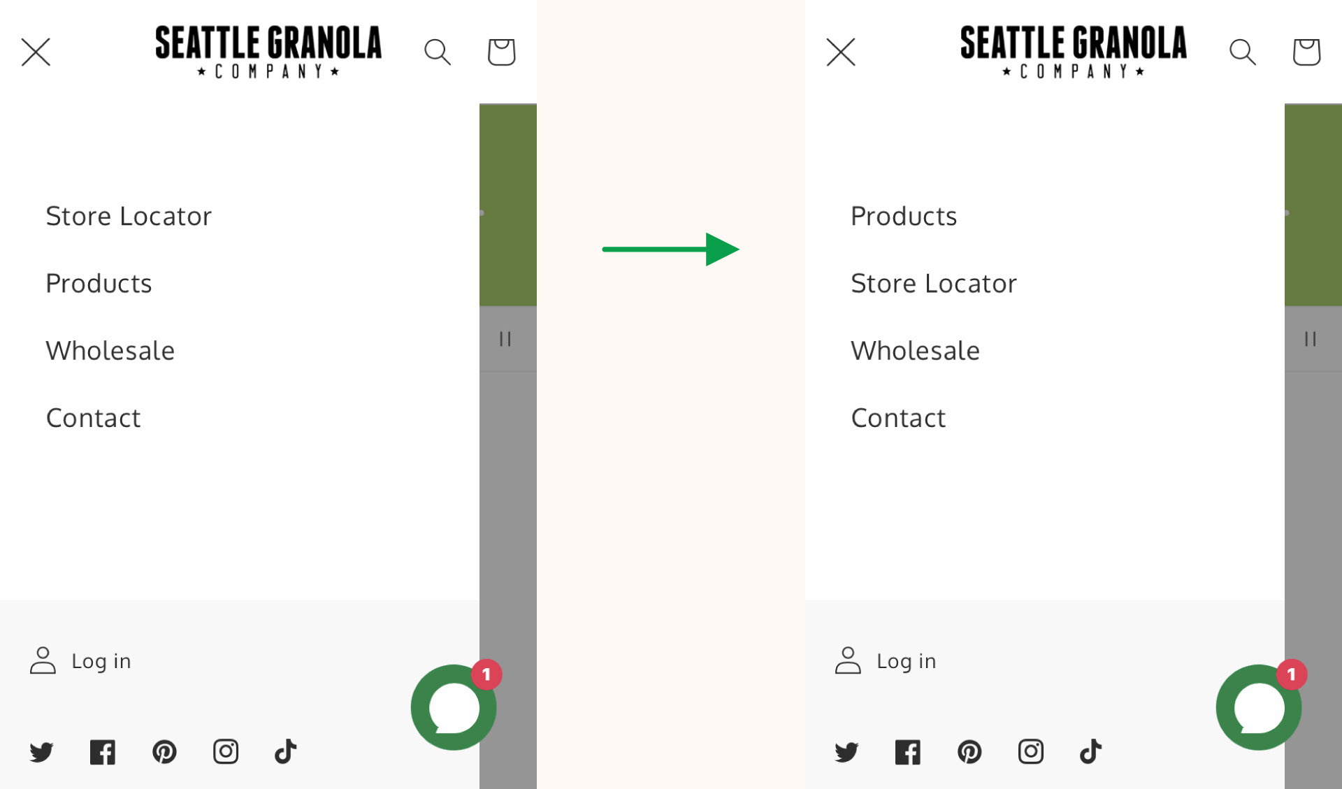
A majority of the company's sales came from grocery stores, so I put our Store Locator at the top of the navigation menu to help customers find the grocery store nearest to them. However, user testing revealed that our customers typically visited our website to order products from us directly, rather than seek information on brick and mortar stores that carry our products.
Conclusion
Let's take a look at how this redesign has impacted Seattle Granola Company's website:
1. Navigation
The website is easy to navigate and allows the user to find the information they need without having to click through multiple pages. The clear structure and layout allows customers to accomplish their goals quickly and easily.
2. Branding
The website is consistent with the Seattle Granola Company brand, following the standards provided by their Brand Identity & Style Guide.
3. SEO
The website ranks above its competitors in search engines.
4. Visual Design
The use of natural colors, playful typefaces and friendly tone-of-voice reflects the company's focus on community, health and wellness.
5. Conversion
As a result of all these improvements, the website now has a higher conversion rate than the average online food and drink store.
All visual assets displayed in this project are the property of 206 Foods, LLC. and their usage is subject to the company's ownership and copyright.