
The Problem
Lack of a consistent style and brand identity.
The Solution
Create a style guide featuring standards for everything from their editorial style to their use of color and typography.
The Outcome
Consistent style and brand identity across all platforms.
Lack of a consistent style and brand identity.
The Solution
Create a style guide featuring standards for everything from their editorial style to their use of color and typography.
The Outcome
Consistent style and brand identity across all platforms.
When I started working as a graphic designer at 206 Foods, there wasn't a consistent identity in place for the Seattle Granola Company brand.
I quickly set to work using what I knew of the brand and how it had been represented in the past to create this style guide for myself and any designers that work there in the future.
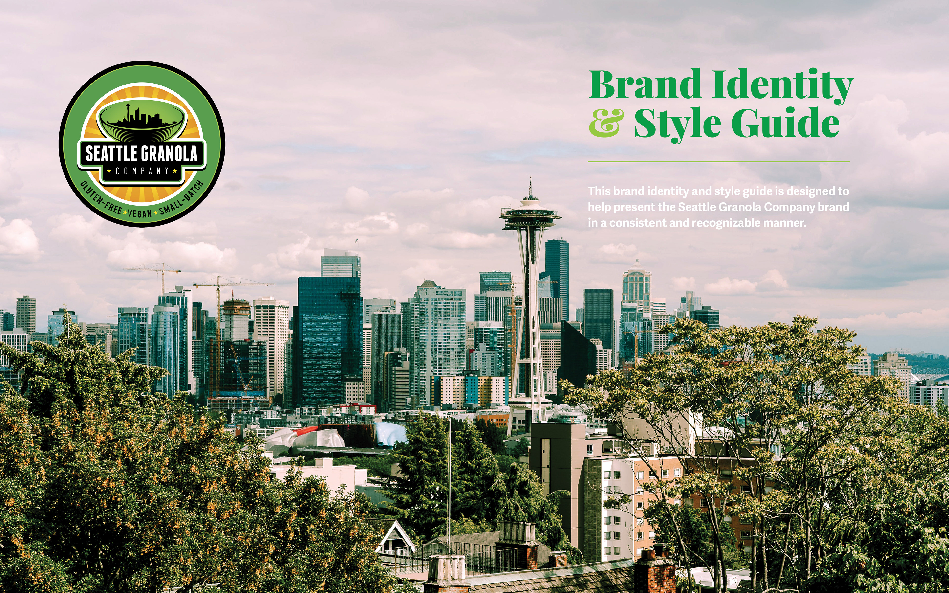
This brand identity and style guide is designed to help present the Seattle Granola Company brand in a consistent and recognizable manner, covering everything from their mission statement to their use of typography, photography and illustration.
I quickly set to work using what I knew of the brand and how it had been represented in the past to create this style guide for myself and any designers that work there in the future.
This brand identity and style guide is designed to help present the Seattle Granola Company brand in a consistent and recognizable manner, covering everything from their mission statement to their use of typography, photography and illustration.
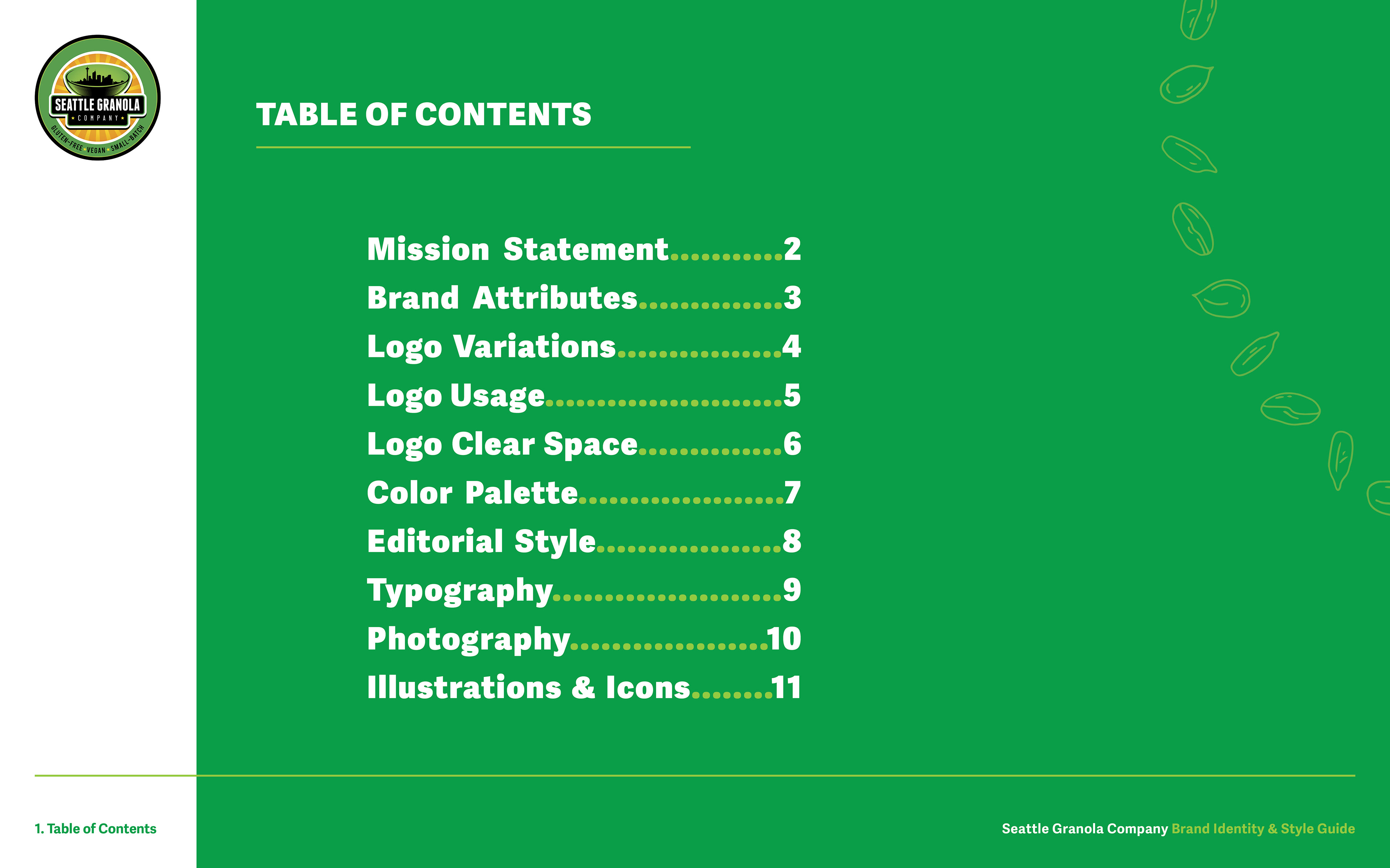
I added a table of contents so that whoever uses this guide will be able to quickly identify the section they need to reference.
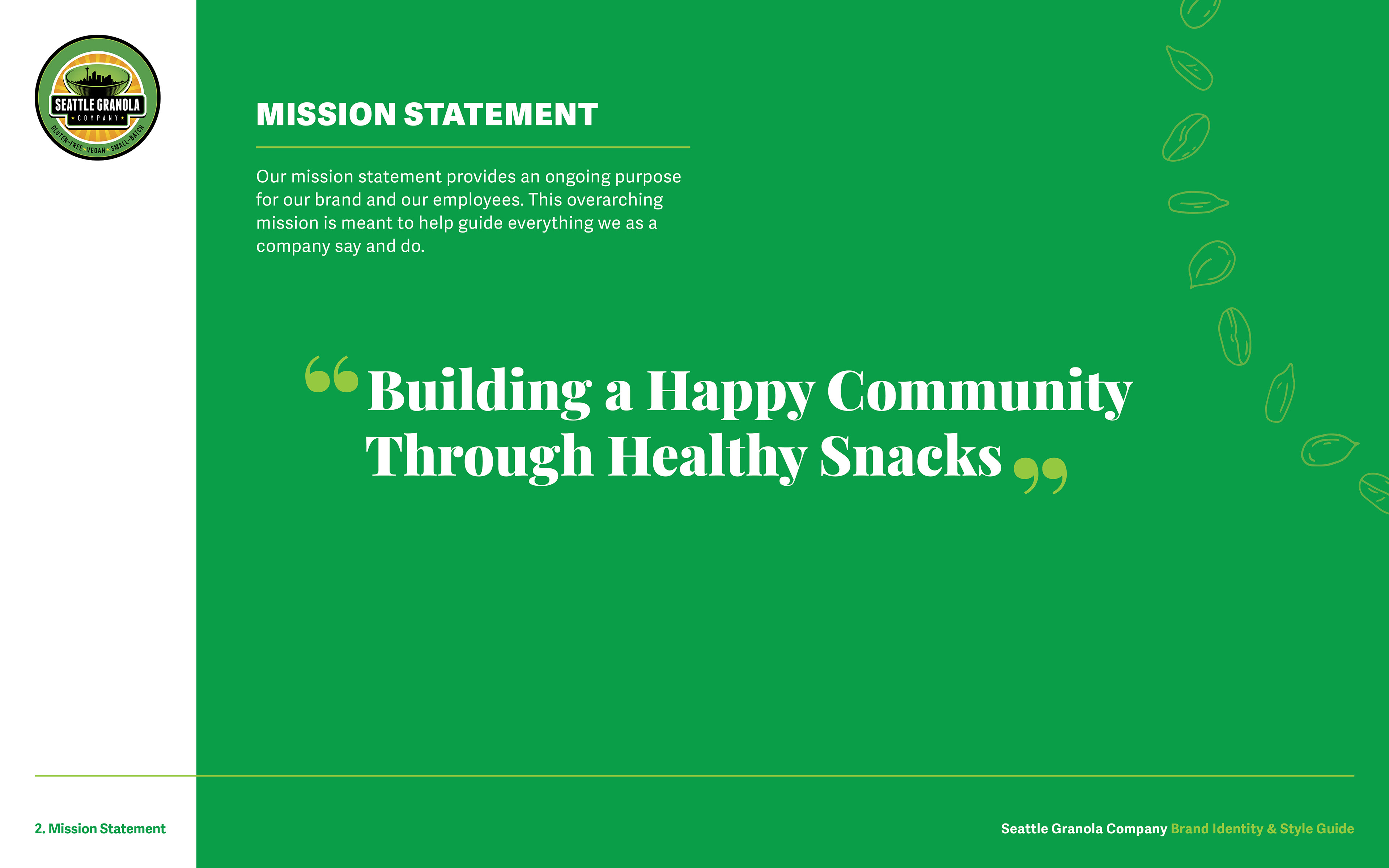
When Seattle Granola Company hired me, they didn't yet have a written mission statement, so I created one. Their products are nutritious and they have very dedicated customers, so this mission statement came naturally: Building a happy community through healthy snacks.
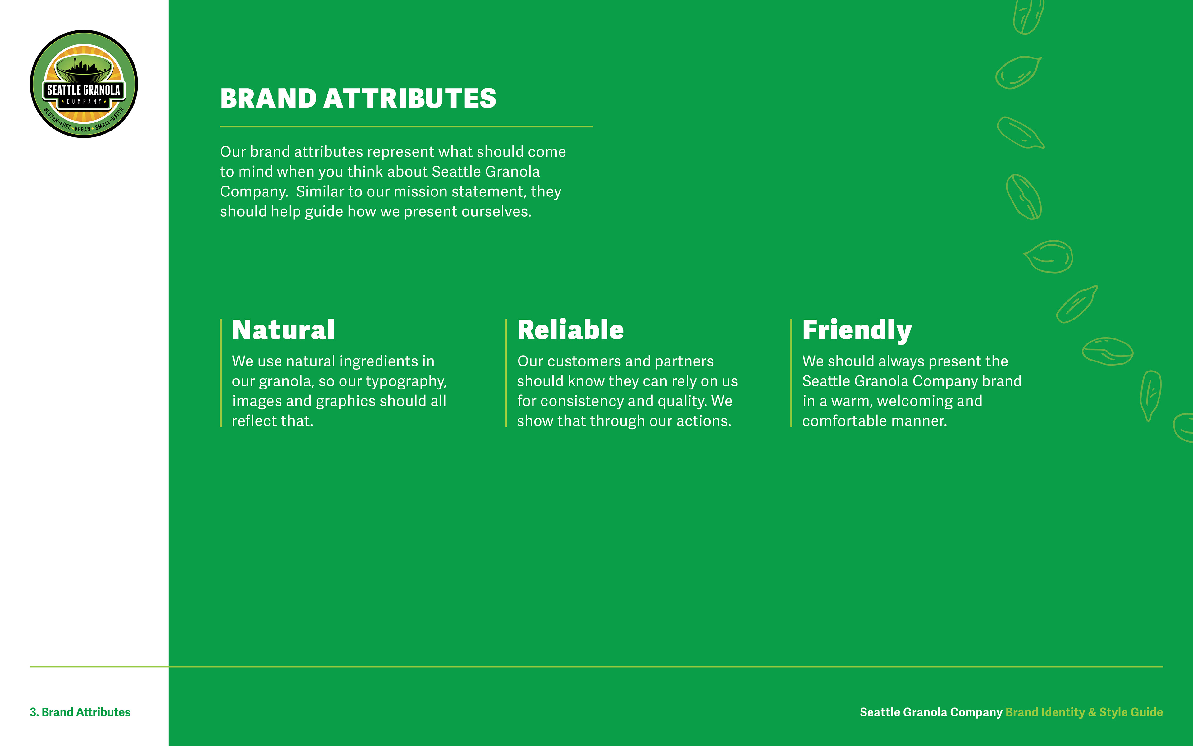
I took what I knew from their existing brand and extracted the three main attributes that stood out to me. Seattle Granola Company is natural, reliable and friendly. Whatever their designers create, from social media content to posters and marketing material, they absolutely must keep these core brand attributes in mind.
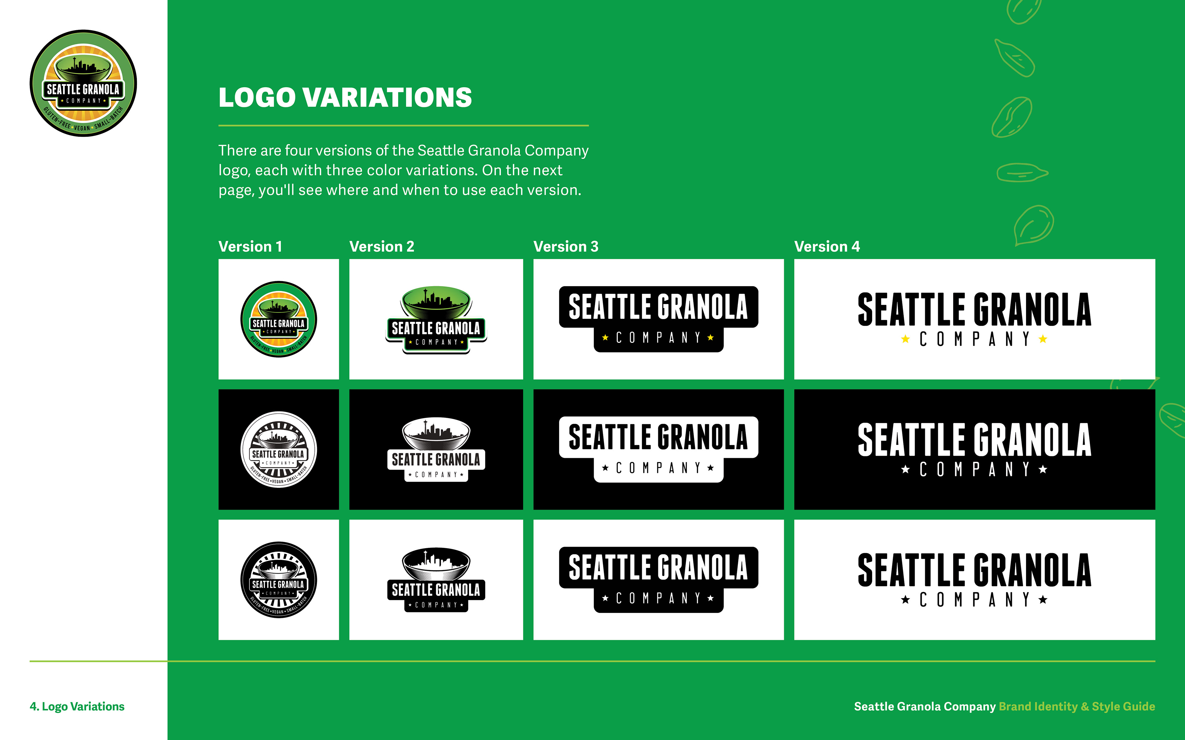
There are four primary versions of the Seattle Granola Company logo. The main logo is quite complex, so we have three more, each simpler than the last.
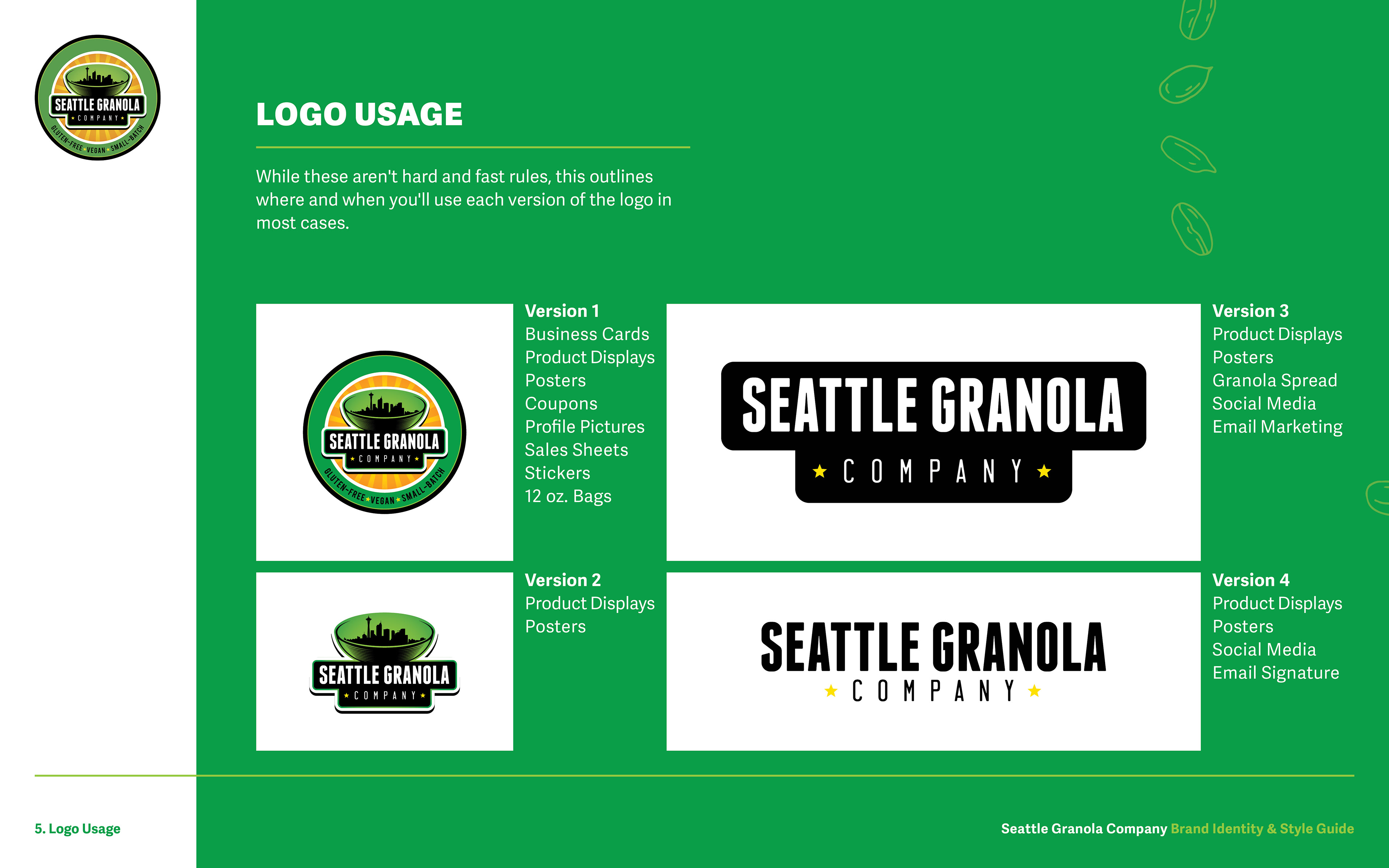
This page outlines where and when you should use each version of the Seattle Granola Company logo.
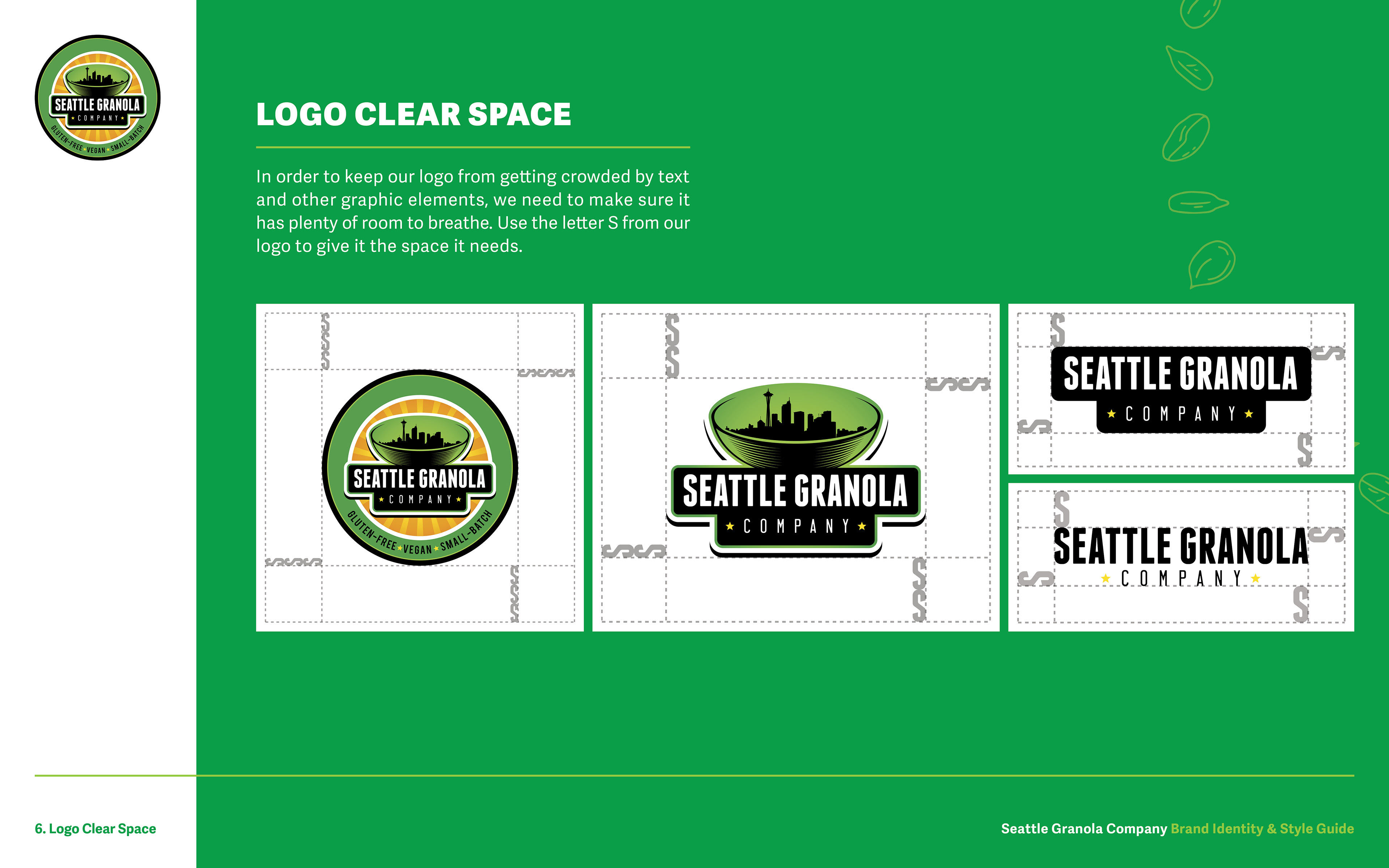
Previously, the logo had been handled somewhat haphazardly, so I created this page to ensure it would be given the space it needed. I decided on using the letter S from the logo as the standard measurement for providing enough room to let the logo stand out from copy or other graphic elements.
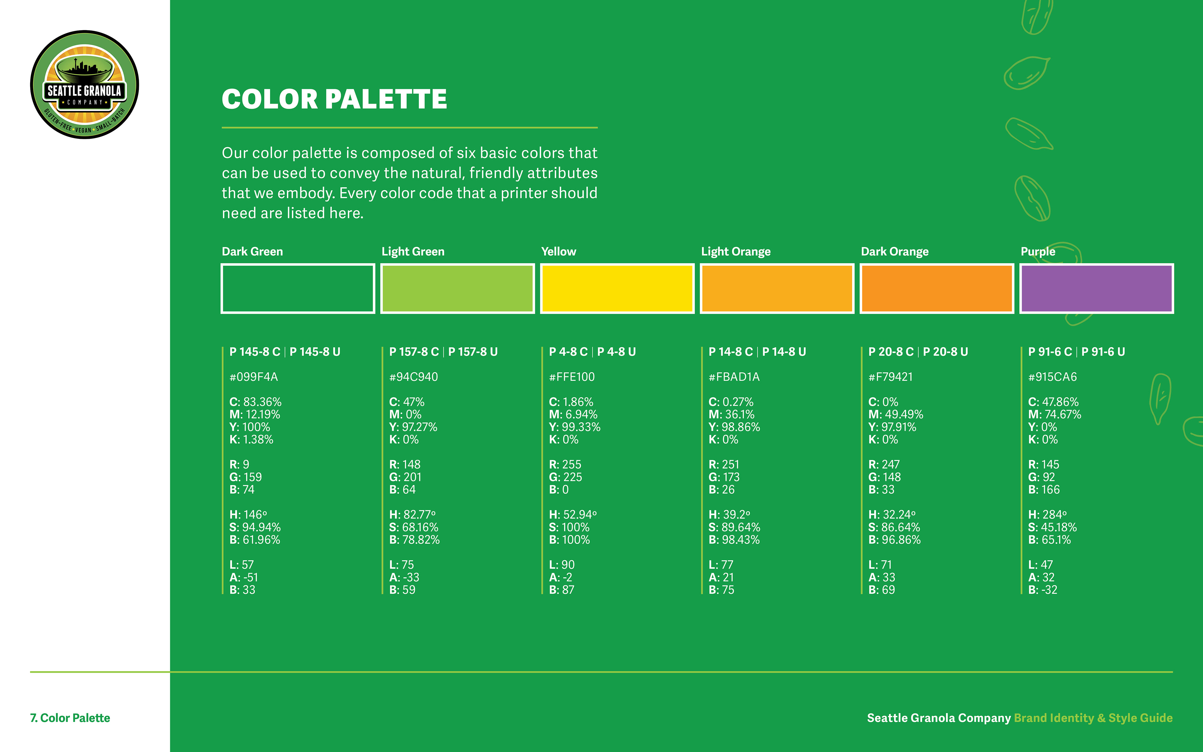
I selected the most prominent colors from their logo and existing packaging to create this color palette, complete with every code a printer or designer would need to reproduce them.
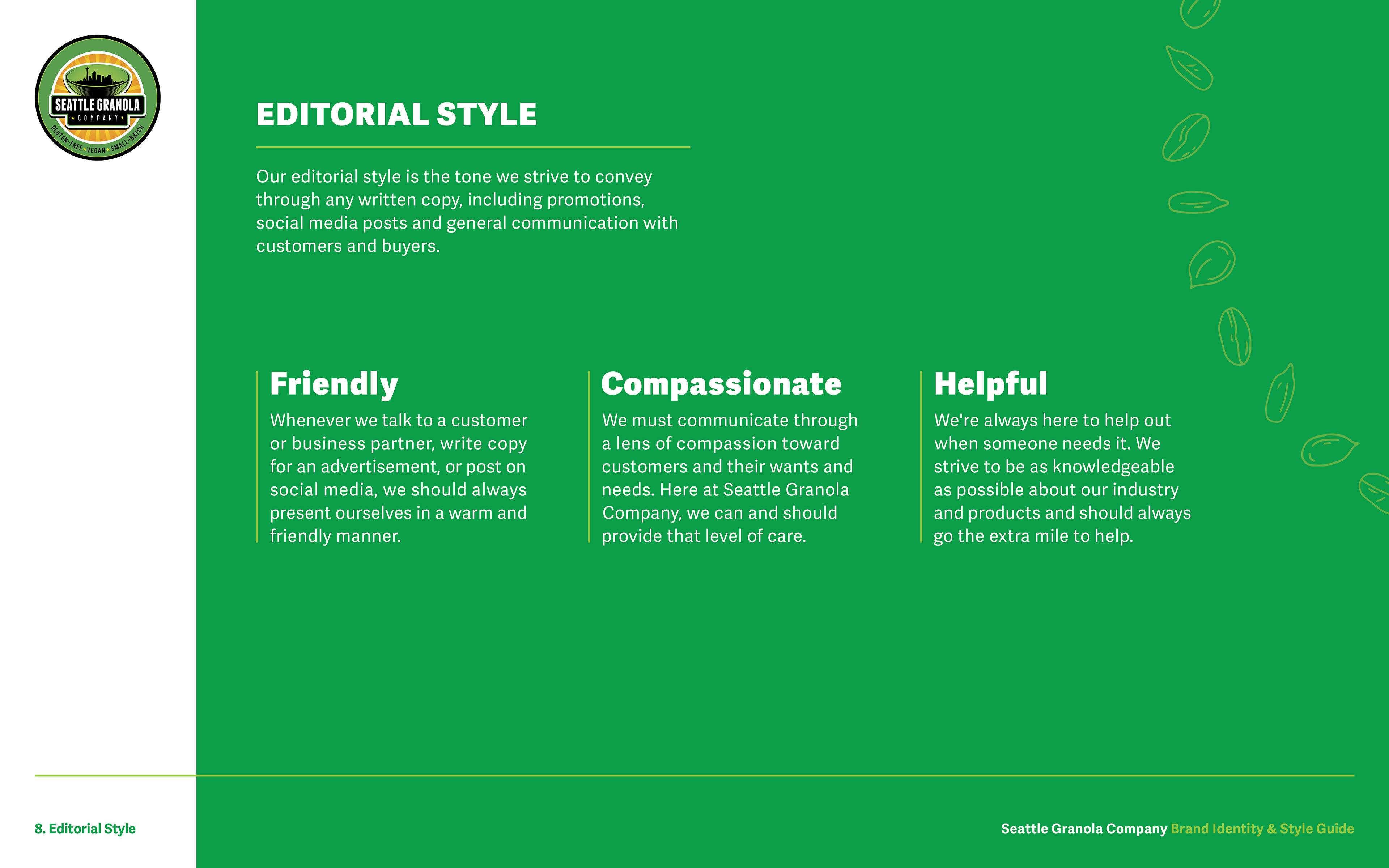
The company's editorial style is reflected in advertising copy, social media posts, marketing materials and email. I decided on these three terms to match our Brand Attributes on page 3.
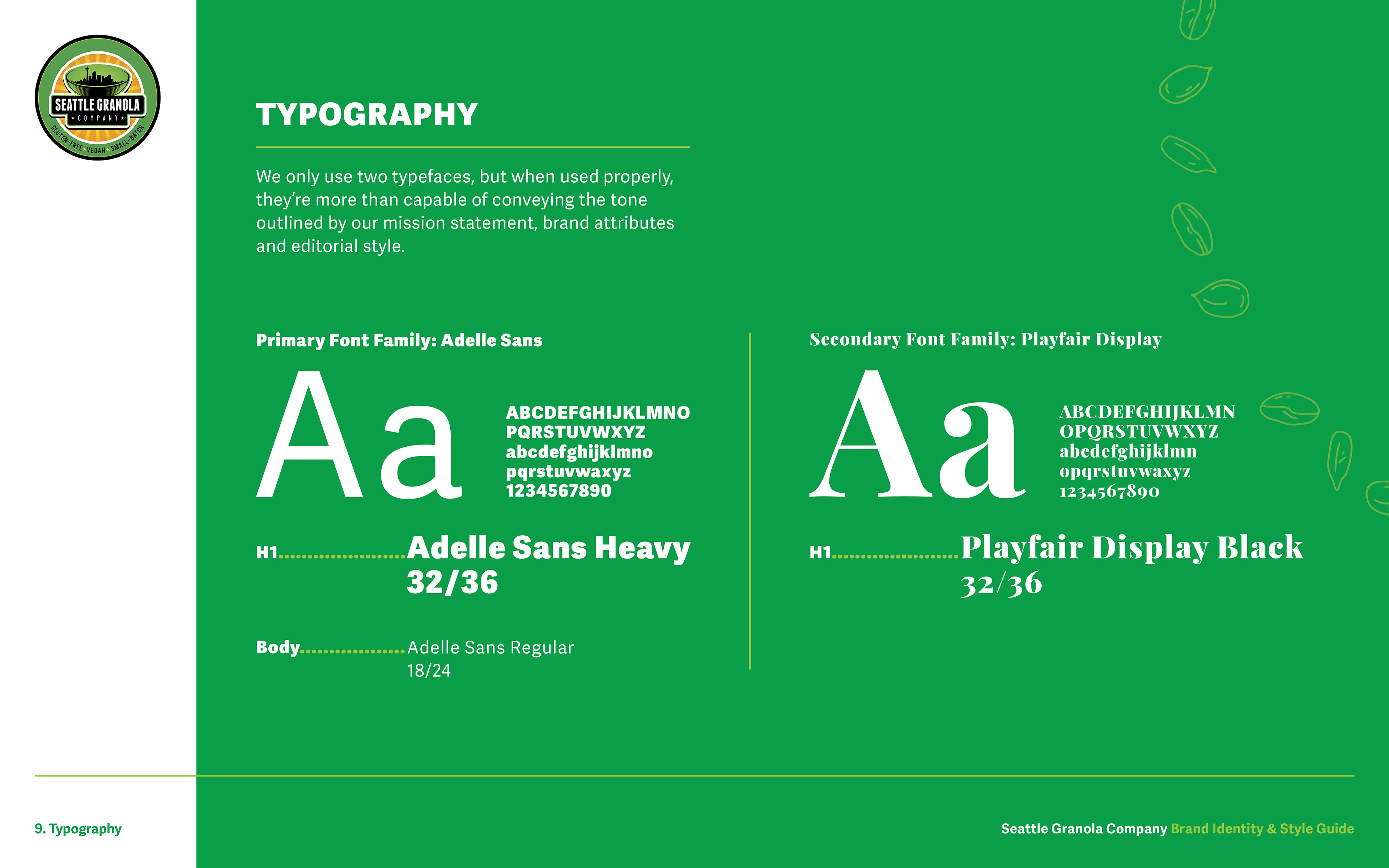
The two typefaces I chose to represent the brand are Adelle Sans and Playfair Display. They're soft and round, providing a friendly appearance, but still remain structured and professional. The mix of serif and sans serif, plus their near-identical x-height, make them a perfect pair.
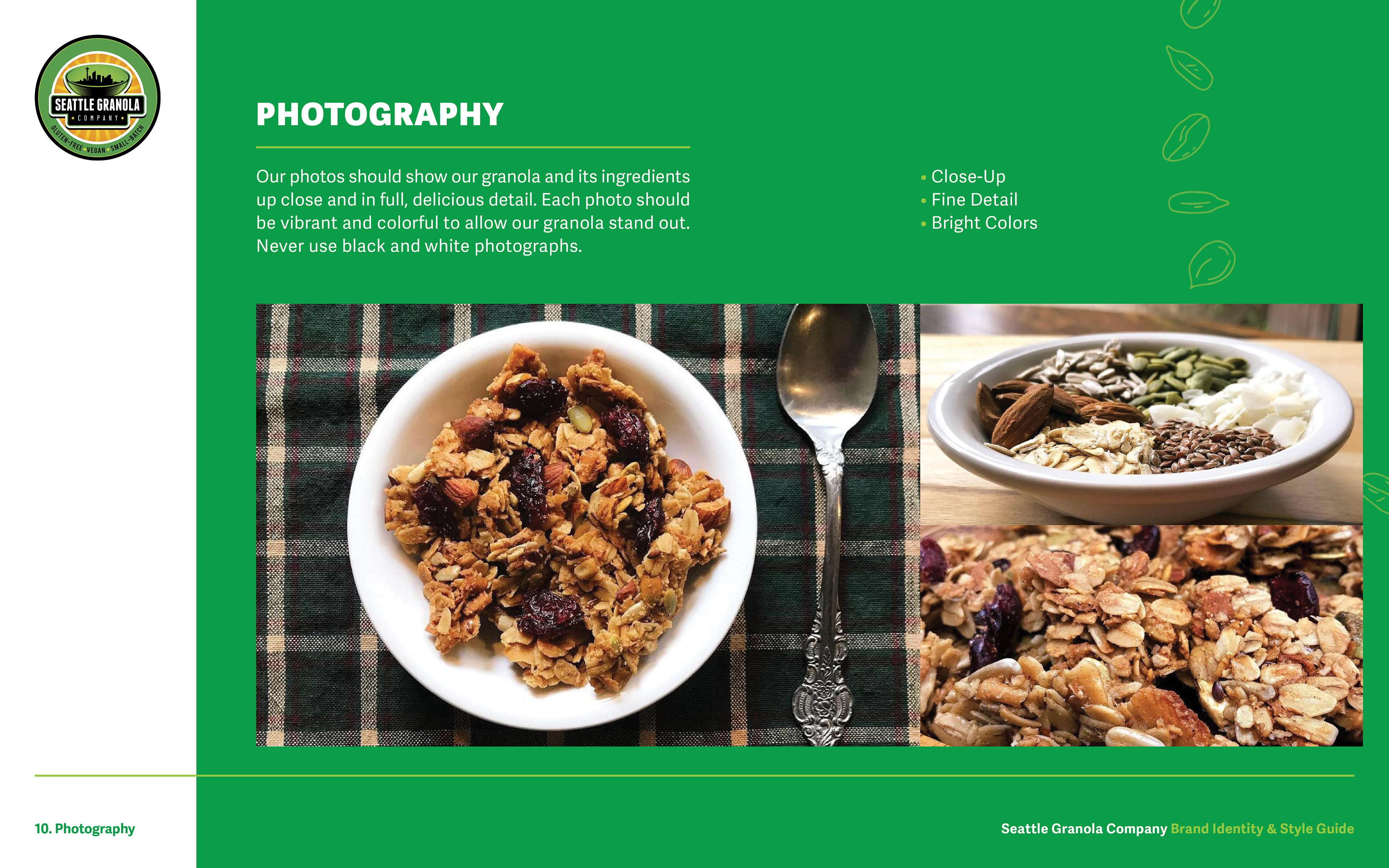
When I joined the company, the photos they were using to represent their products had little to no lighting and low picture quality, making their granola appear almost unappetizing. I quickly set some photographic standards to make sure their products look as delicious as they taste.
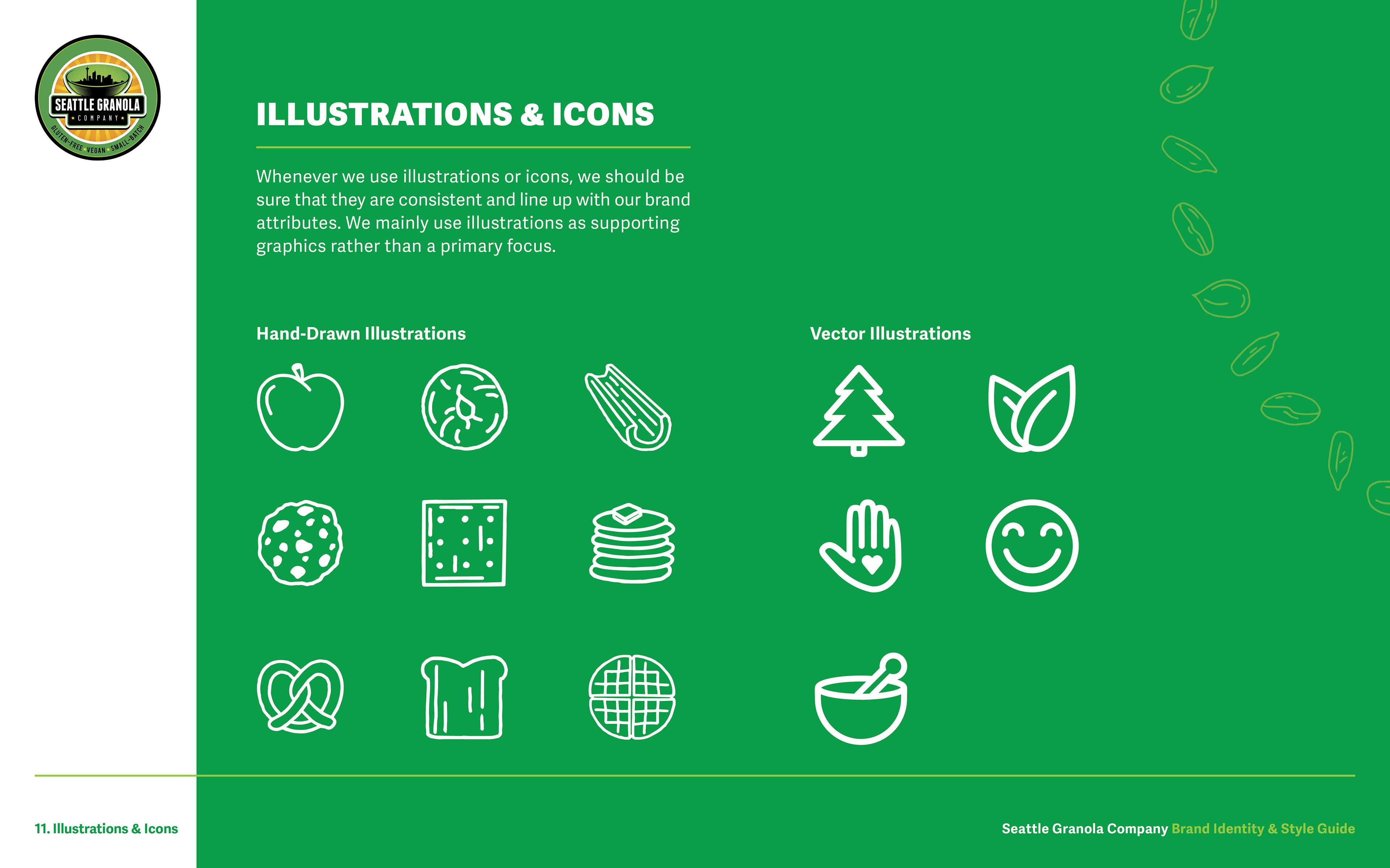
As I was designing some of Seattle Granola Company's packaging, I created these illustrations and icons to accompany the more informative aspects of the labels. They're light, friendly and playful, reflecting the brand attributes and editorial style.
Conclusion
With this seemingly simple guide, Seattle Granola Company's graphic designers, copy writers and photographers can now confidently present the brand consistently across all platforms and mediums.
To see how I implemented this style guide in practice, check out the E-Commerce UX/UI Redesign project I led for Seattle Granola Company.
All visual assets displayed in this project are the property of 206 Foods, LLC. and their usage is subject to the company's ownership and copyright.
To see how I implemented this style guide in practice, check out the E-Commerce UX/UI Redesign project I led for Seattle Granola Company.
All visual assets displayed in this project are the property of 206 Foods, LLC. and their usage is subject to the company's ownership and copyright.